Stauning Whisky Of Denmark ™ Marks 20th Year Since Foundation With Reimagined Core Range Celebrating Danish Design And Craftsmanship
Danish distillery Stauning is rolling out a comprehensive rebrand this summer, and it’s worth paying attention to what they’re doing here. The new packaging represents more than just a cosmetic refresh – it signals the distillery’s renewed confidence as an independent operation after Diageo’s exit from their Distil Ventures portfolio.
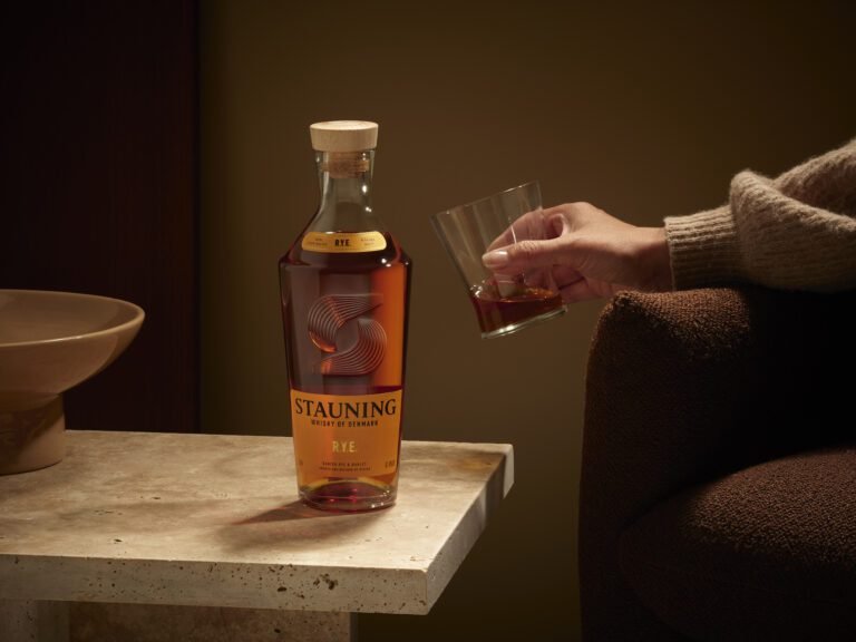
What caught my eye is how they’re positioning this rebrand. Rather than chasing the familiar comfort zones of Scotch or bourbon aesthetics, Stauning’s doubling down on their Danish identity. The new bottle design embraces clean architectural lines with what they describe as Scandinavian design principles, while still nodding to classical whisky traditions. There’s a thoughtful touch in their reimagined brand symbol – nine lines representing the original nine founders, centered around a grain motif that speaks to their grain-to-glass approach.
The timing feels deliberate. After a period of reorganisation following Diageo’s departure, they’re launching this refresh across more than 20 international markets, starting with their Danish R.Y.E. and HØST expressions this late summer. Co-founder Alex Munch frames it as honoring their 20-year journey from “wild idea among friends” to acclaimed New World whisky producer.
What’s particularly interesting is their target audience strategy. Marketing Director Scott Milne talks about appealing to “design-conscious and flavor-curious” drinkers – those seeking alternatives to traditional Scotch and bourbon. In an increasingly crowded whisky landscape, that focus on Danish distinctiveness could be exactly what sets them apart.
The full range will sport the new look by late 2026, so we’ll have plenty of time to see how this gambit plays out in the market.